SIMPLIFY AND CLARIFY

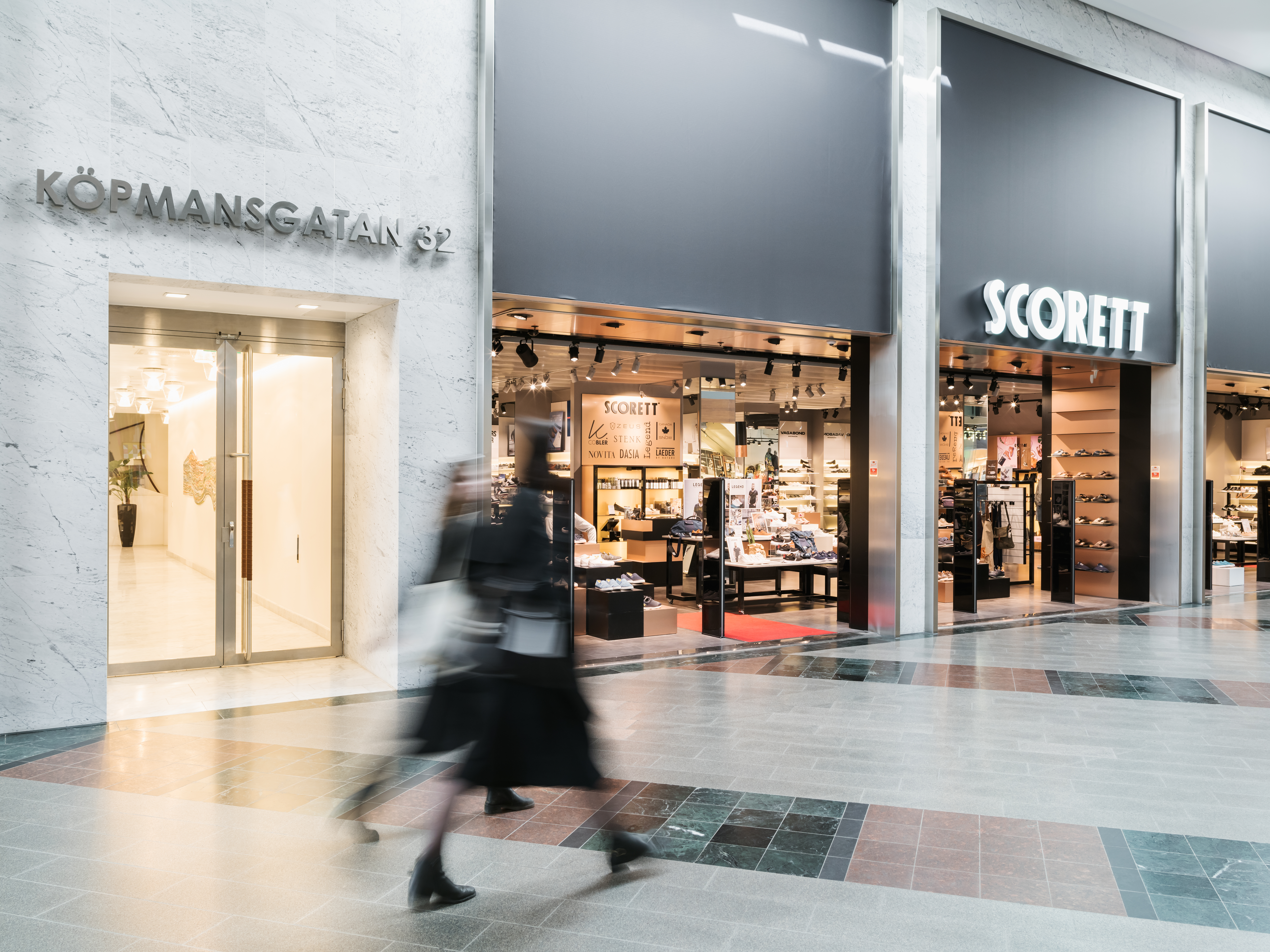
Our task in Kvarter 4 was to give the facades a structured and uniform expression in order to promote trade and to ensure they stood out in all the commercial noise of Nordstan. The renovation of the area has taken place in two stages.
Our goal was to clarify the commercial ‘look’ and rework the property’s impressive corner locations. This meant the horizontal facade division was removed and replaced with a more vertical expression in the form of two-storey portals. The upper part of the portals featured a textile sign, which addressed a problem that shop windows on the upper level had been having with glare from the ceiling lanterns. In order to boost commerce in the vicinity a restructuring of the store premises was conducted to intensify the presence of businesses in the longer facade sections.
The idea was to increase the scale of the storefronts’ identities and signs in order to achieve better visibility and a cleaner look. We have worked with solid materials, such as marble and stainless steel, and chosen a holistic approach that frames and ‘subdues’ the environment while highlighting the stores.
