AN UPDATED CLASSIC
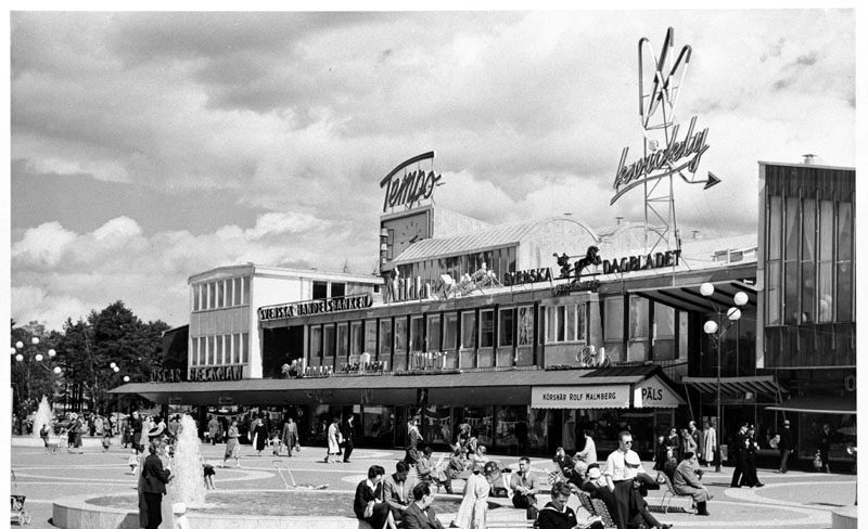
Vällingby Centrum is Sweden’s first ABC city – a city planning concept built on the idea that residents should be able to live, work, shop and get access to services all within close proximity. The city was inaugurated in 1954, and today is a distinctive place full of architectural gems. In 2017, together with Svenska Bostäder, we began work on a new graphic identity and signage in Vällingby Centrum.
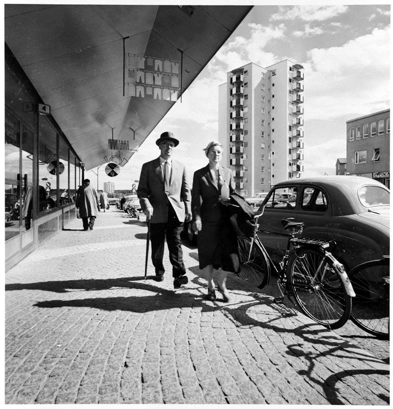
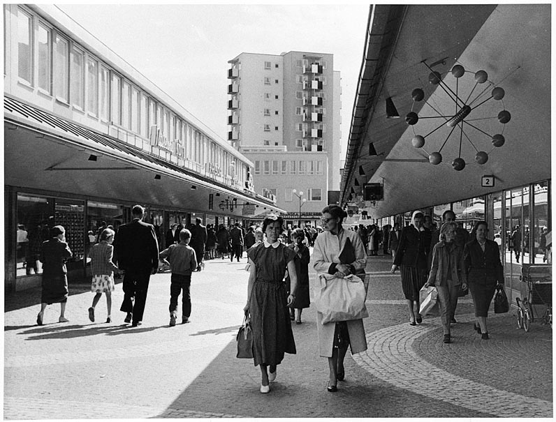
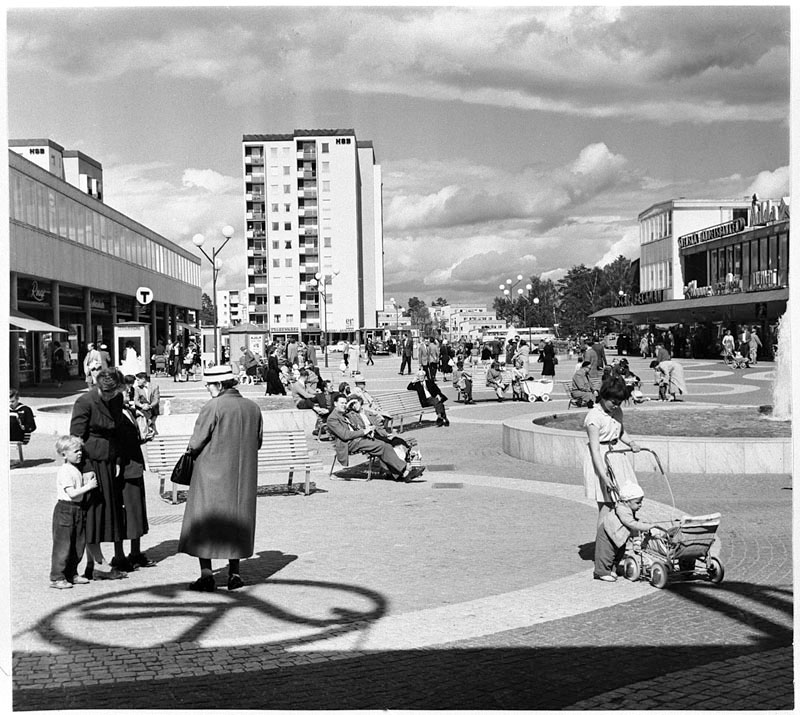
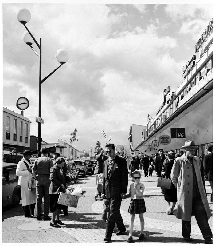
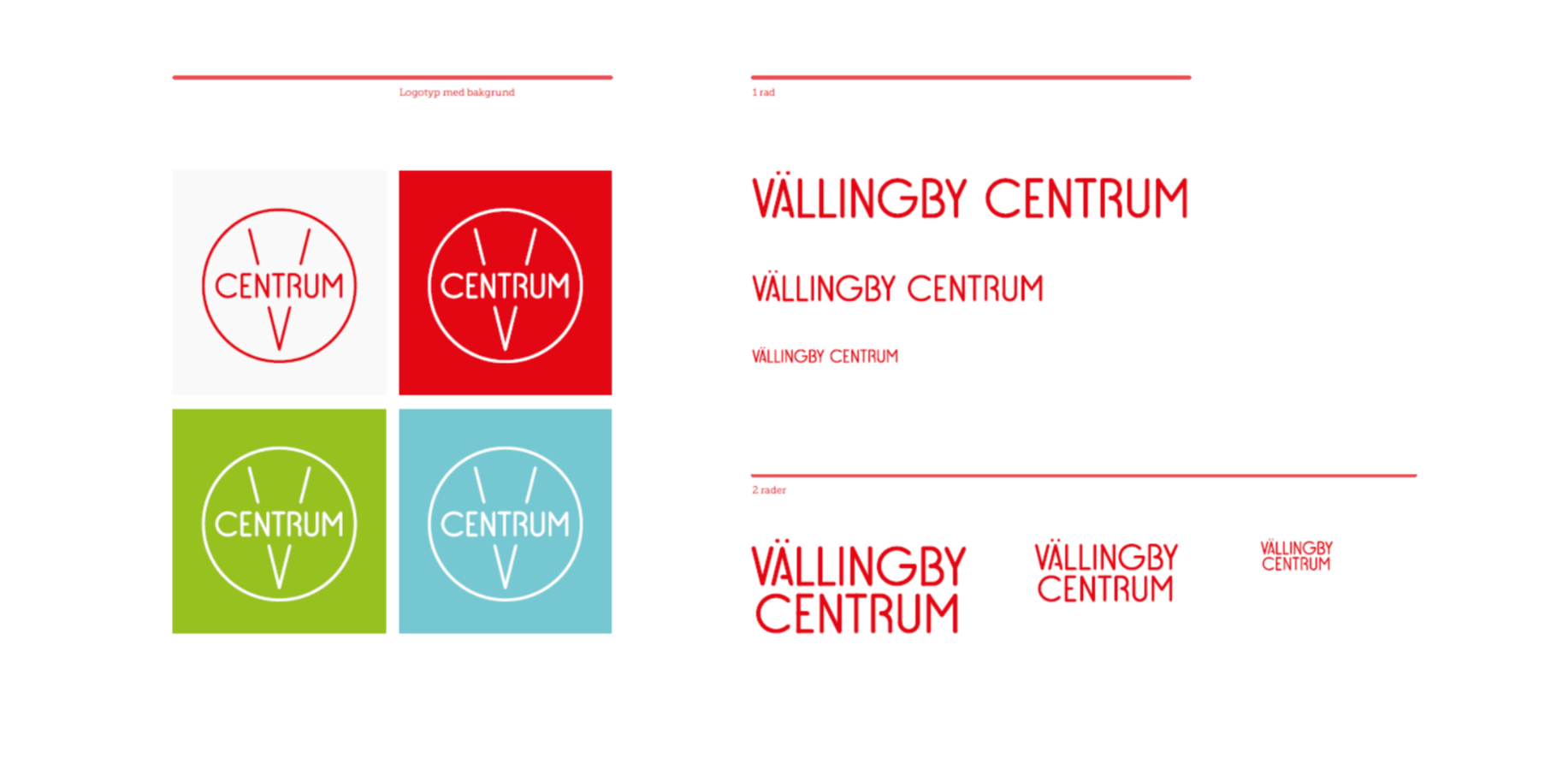
In order to preserve the centre’s historical past and remain true to its roots, it was important to reclaim the original name Vällingby Centrum from the name of Vällingby City that it had been given in more recent years. A guiding principle in our work was to strengthen the design ethic that characterises the location and its impressive architecture.
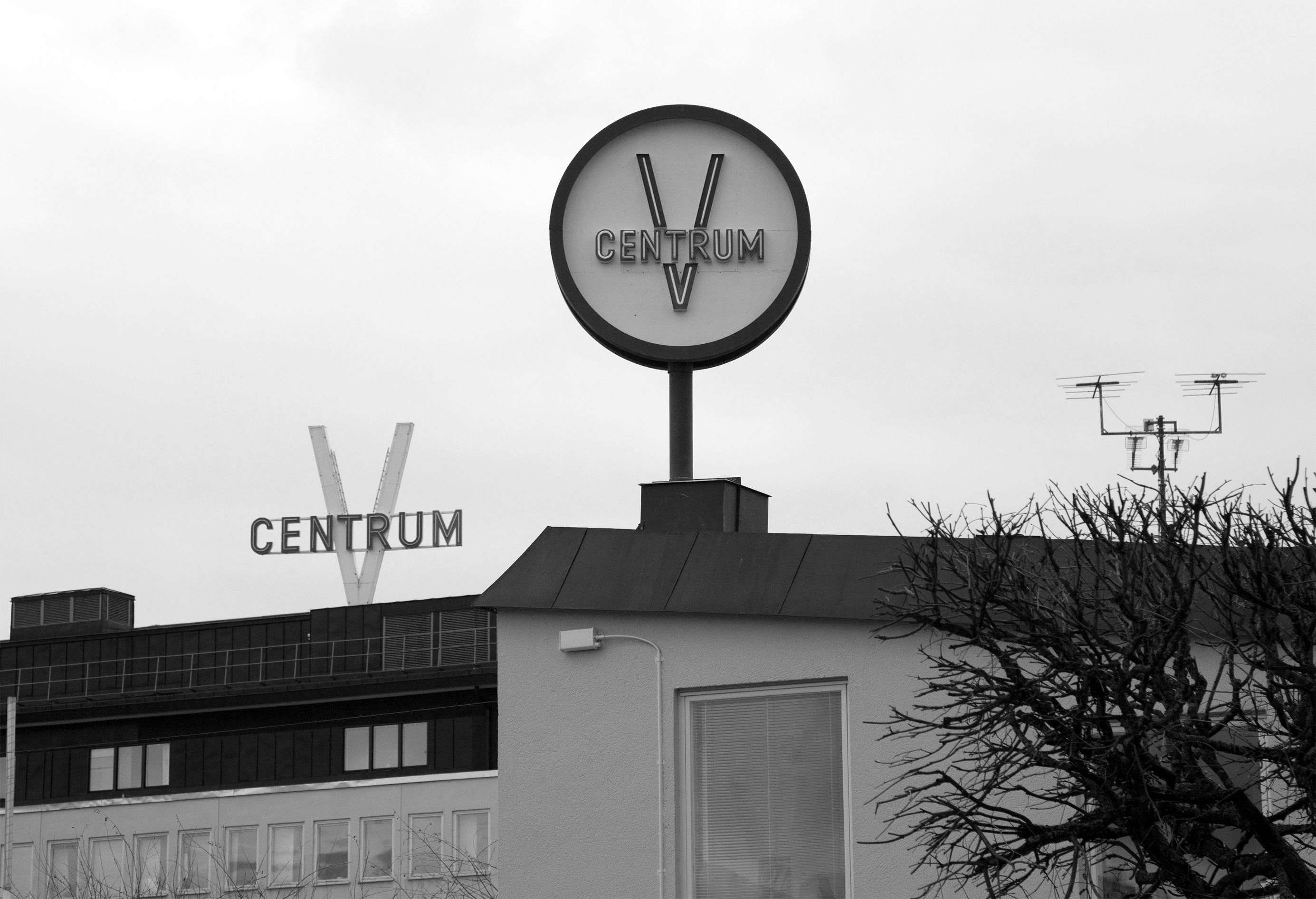
A new logo was developed that combined history with character, and that functioned equally well both as a large external sign and a small logo for social media channels. The graphic identity’s colour scale is warm to accentuate the personal and welcoming atmosphere in Vällingby Centrum. The circle was the starting point for our shape and was inspired by the physical layout of the area.
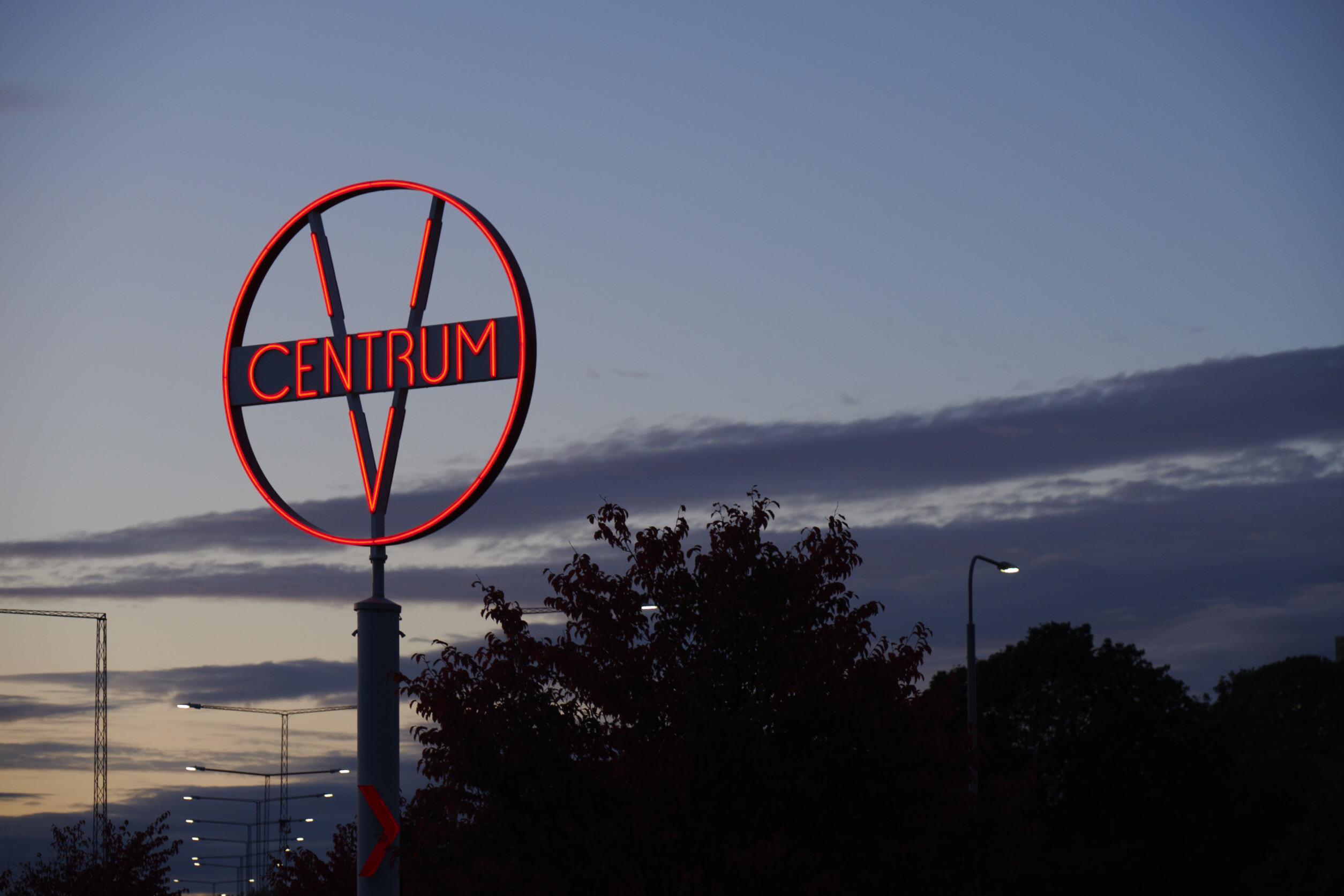
New signage was introduced at the entrances to the centre. We worked with structure, readability and orientability, where the buildings’ own advantages and appearance were highlighted. Signs were specifically designed for each location with inspiration from Vällingby’s classic 50s character, featuring a stripped down and functional look with neon tube-inspired lighting. The signs consist of cut-out letters or the logo, placed on the facades or freestanding, double-sided, stationary or rotating.
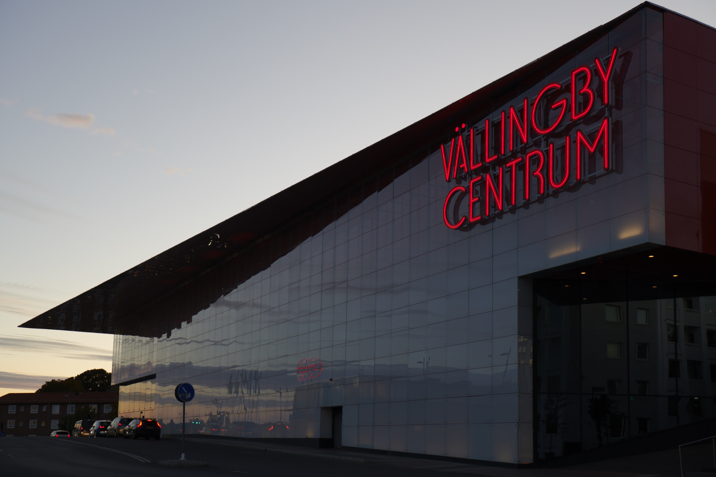
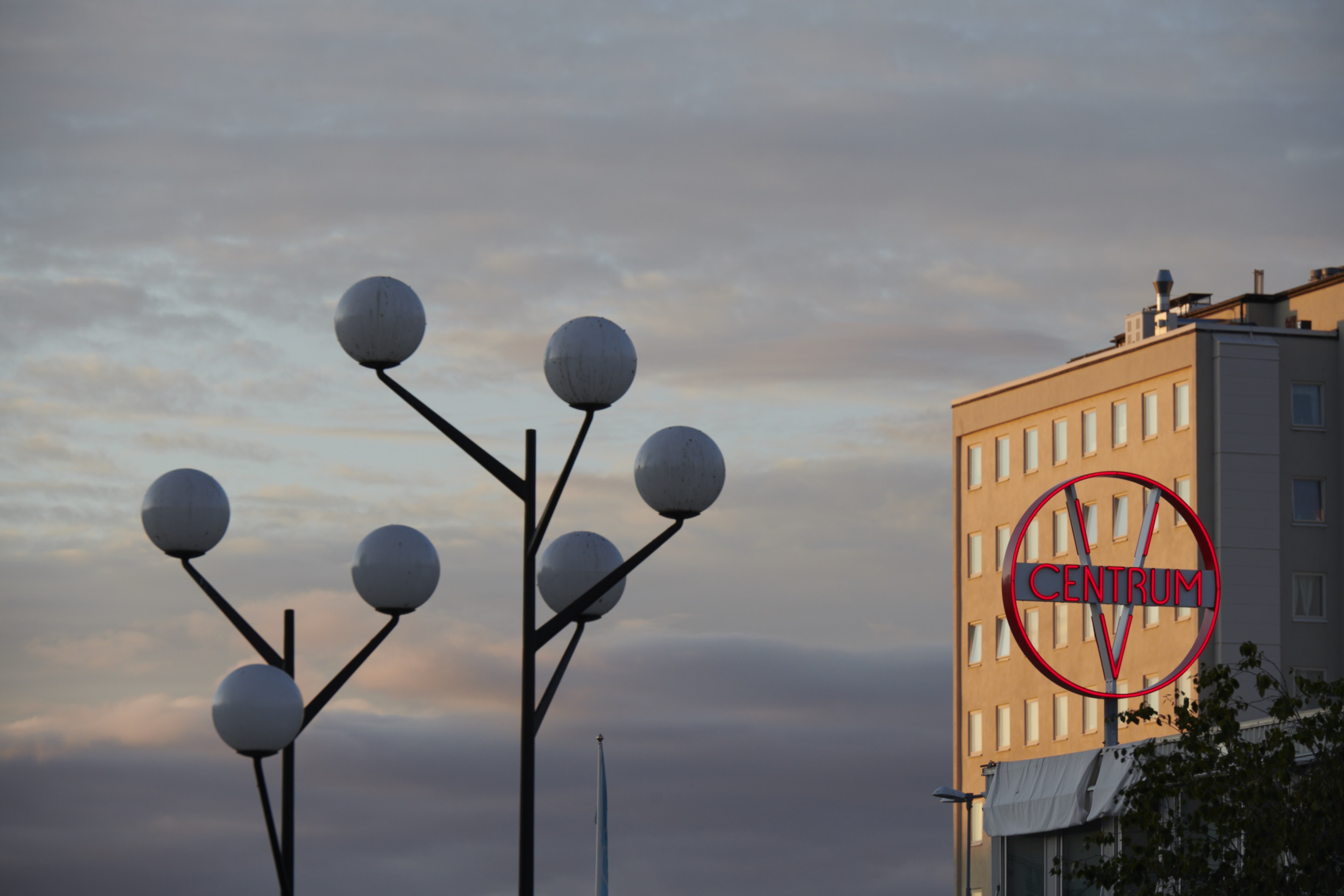
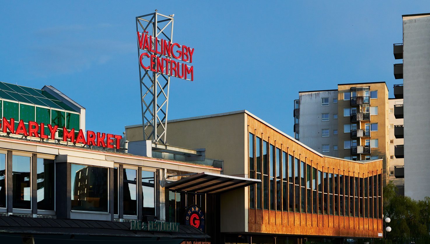
On K2, Centrumhuset’s main roof, a sign with illuminated cut-out letters was placed on a tall steel mast as a clear and welcoming symbol that can clearly be seen from Vällingby Torg. It reawakens the original appearance of the facade and roof which once had a mast that displayed the neon signs of local stores.
